
First of all, this article has a bit of a headline, and I apologize to the readers. The headline of this article is the layout engine. But I suggest that you must read this headline party article, and you will definitely gain something after reading it.
Why write this article?
A few days ago, I released one of my front-end open source projects named: Fower. Many users have asked me what is the difference between Fower and Tailwindcss. My answer is that Fower has the same philosophy in utilty-first. In fact, CSS framework with the utilty-first concept has existed for a long time, such as: ACSS, Tachyons.
One of the biggest differences between Fower and Tailwindcss is that Fower provides a very easy-to-use layout tool: Fower Layout toolkit, which is the reason for writing this article. Below I will share in detail the original intention of developing the Fower layout and its design ideas.
Web layout history
Let's briefly review the history of Web layout. During the entire evolution of Web layout, we have experienced no layout, table layout, positioning layout, floating layout, Flexbox layout, and Grid layout. I will not elaborate on the characteristics and advantages and disadvantages of each layout here. I will only talk about my personal views and conclusions: at the current stage, considering the functionality, ease of use, browser compatibility, etc., using Flexbox layout is the best choice. Some people who are interested in learning more can read the following article.
The core of the layout
In my opinion, the core of layout is to deal with the spatial relationship between container and items in a certain direction (x, y). There are four essential elements here: container, element, direction, and spatial relationship. In fact, this is also the core of flexbox layout. Almost all concepts and usages of flexbox layout are developed around these four elements. When we get a design draft, if we can quickly identify the containers and elements in it, and clarify their spatial relationship, we can quickly build the interface.
Layout in Sketch and Figma


Figma and Sketch are two very well-known design software. We can see that they consistently use very vivid directives in the processing of element spatial relations: align to top, align to right, align to bottom, align to left , Align base on space. This is also the most intuitive way.
Layout In Swift UI and Flutter
Now we look at two modern UI solutions: Swift UI and Flutter, how they deal with UI layout.
In Swift UI, we can see keywords such as HStack, VStack, aligment, space, etc. We found that Swift UI is also developed around four elements: container, element, direction, and spatial relationship:
struct ContentView: View {
    var body: some View {
        HStack(alignment: .top) {
            VStack {
                CalendarView()
                Spacer()
            }
            VStack(alignment: .leading) {
                Text("Event title").font(.title)
                Text("Location")
            }
            Spacer()
        }.padding()
    }
}
In Flutter, we can see keywords such as Row, Column, aligment, and space. We find that Flutter is also developed around the four elements of container, element, direction, and spatial relationship:
Row(
  mainAxisAlignment: MainAxisAlignment.spaceEvenly,
  children: [
    Image.asset('images/pic1.jpg'),
    Image.asset('images/pic2.jpg'),
    Image.asset('images/pic3.jpg'),
  ],
);

Column(
  mainAxisAlignment: MainAxisAlignment.spaceEvenly,
  children: [
    Image.asset('images/pic1.jpg'),
    Image.asset('images/pic2.jpg'),
    Image.asset('images/pic3.jpg'),
  ],
);
We found that the layout concept of Swift UI and Flutter is very similar to Flexbox layout. In addition, we found that their layout code is directly attached to the container and elements, unlike the traditional Web, where the style code needs to be separated into a single CSS File. Fower and Swift UI and Fluter use similar concepts, style is part of the container and elements, which is also the choice of modern UI development
Some references:
- https://www.swiftbysundell.com/articles/swiftui-layout-system-guide-part-1/
- https://flutter.dev/docs/development/ui/layout
Disadvantages of Flexbox layout
The above mentioned the layout methods of design software and modern UI frameworks. They are very similar to the Flexbox layout concept. What are the shortcomings of the Flexbox layout?
Although Flexbox is excellent, but for me, it has one of the biggest shortcoming that it's not developer-first. Flexbox layout is not easy to use enough, and the developer experience is not good enough.
Flexbox has many concepts: main axis, cross axis, direction, align-item, justify-content, flex-start, flex-end, flex-center, etc. The biggest problem is that when the direction of the main axis changes, attributes such as align-items, justify-content make the presentation of the UI very inconsistent with human intuition. Especially for me who are not always writing UI (I often need to write backend, do miscellaneous, etc.), every once in a while, I may forget the usage of align-items, justify-content.
My ideal layout (design plan)
Above we talked about the shortcomings of Flexbox layout: not developer-first.
My ideal layout method should be as easy to use as modern design software. We only need to pay attention to the four elements of the layout: container, element, direction, and spatial relationship. The usage is to find the container and the element, set the direction of the element in the container, and then set the spatial relationship.
The core here is how to express spatial relationships. I think the most intuitive way of expression is to design software. I abstract this way of expression as: toCenter, toCenterX, toCenterY, toTop, toRight, toBottom, toLeft, toBetween, toAround, toEvenly.
- toCenter, make children elements align to center, see Online Demo
- toCenterX, make children elements align to center horizontal, see Online Demo
- toCenterY, make children elements align to center vertical, see Online Demo
- toTop, make children elements align to top, see Online Demo
- toRight, make children elements align to right, see Online Demo
- toBottom, make children elements align to bottom, see Online Demo
- toLeft, make children elements align to left, see Online Demo
- toBetween, make children elements space between, see Online Demo
- toEvenly, make children elements space evenly, see Online Demo
- toAround, make children elements space around, see Online Demo
Regardless of whether your container is horizontal (row) or vertical (column), the expressions of these directives such as toRight and toBottom will conform to your visual habits.
Why is this abstract expression better? I think there are several advantages:
- It is more in line with human intuition. You only need to remember to deal with the spatial relationship according to the direction, such as: toRight, toBotom, etc. There is nothing more in line with human intuition. The other advantage is that your memory burden will become very small.
- Less code, better maintainability, higher development efficiency
My ideal way of writing code (pseudo code):
1.The following code will automatically center the elements in the container horizontally and vertically, and the container direction is row by default, so it can be omitted:
<Container toCenter>
  <ItemA />
</Container>
The effect is as follows:

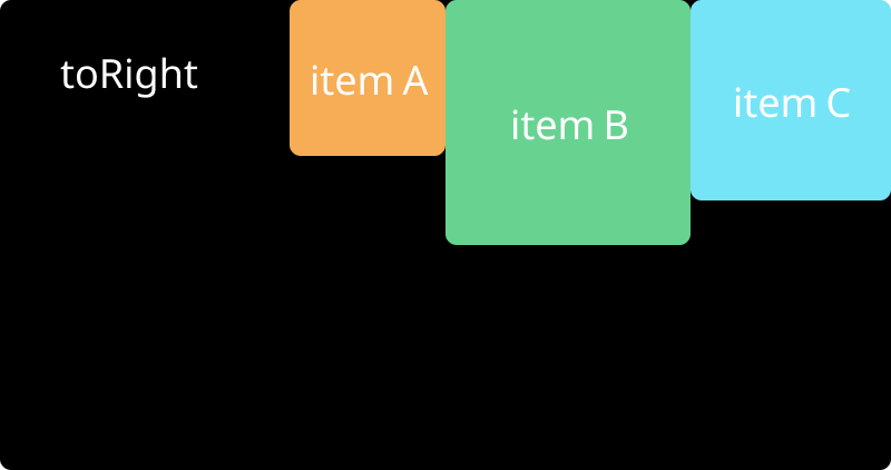
2.The following code will align the three elements A, B, C to the right in the container. The container defaults to row, so it can be omitted:
<Container toRight>
  <ItemA />
  <ItemB />
  <ItemC />
</Container>
The effect is as follows:
3.The following code will align the two elements A and B to the right in the container. This time we declare column, so the elements are arranged vertically:
<Container column toRight>
  <ItemA />
  <ItemB />
</Container>
The effect is as follows:

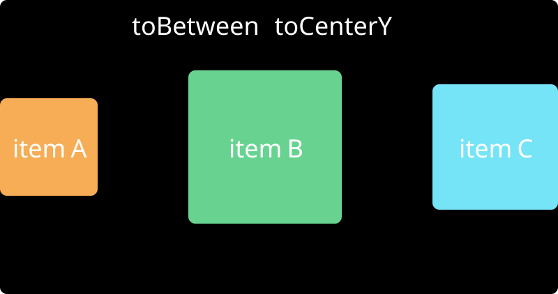
4.Use composition:
<Container toBetween toCenterY>
  <ItemA />
  <ItemB />
  <ItemC />
</Container>
The effect is as follows:
Here are just four pseudo-code examples. In fact, you can use "toLeft", "toRight" and other directives to implement most of the UI layout.
Above, we abstracted the expression of spatial relations and applied directives to the container. Let's take a look at a layout effect, how would you build it with code?

Let me talk about my ideal plan, the pseudo code is as follows:
<Container toBetween toCenterY>
  <ItemA />
  <ItemB selfBottom />
  <ItemC />
</Container>
Here we abstract another type of directives: selfTop, selfRight, selfBottom, selfLeft, selfStretch. These directives can act on elements to individually control the alignment of elements.
So we have some directives that act on elements:
- selfTop, make elements seft align to top
- selfRight, make elements seft align to right
- selfBottom, make elements seft align to bottom
- selfLeft, make elements seft align to left
- selfStretch, make elements seft to Stretch
Finally, summarize our layout tool design plan:
- Container Direction control directives, use row, column, if not declared, the default is row
- Container Alignment directives for internal elements: toCenter, toCenterX, toCenterY, toTop, toRight, toBottom, toLeft, toBetween, toAround, toEvenly, these directives can be used to control the alignment of sub-elements, and have nothing to do with row and column directions
- Element Self-alignment directives: selfTop, selfRight, selfBottom, selfLeft, selfStretch. These directives individually control the alignment of the element itself
- When any container instruction is used, the flexbox layout will be triggered automatically, no need to manually set the
display: flex;
The above 4 design concepts are my personal ideal layout.
Fower Layout
Back to our title: A developer-first layout engine for web. In fact, flex layout cannot be called a layout engine, so what is it? Maybe we call it a layout toolkit will be more appropriate.
The layout engine here refers to: Fower layout toolkit,A layout tool based on flexbox.
The biggest feature of Fower layout is developer-first, it is very simple to use and in line with people's intuition.
For more detailed information about Fower Layout, you can look at the introduction of the official document: Fower Layout Introduction